
Insights
Your Website Isn't a Brochure. It's the Hardest-Working Person on Your Team.
Your Website Isn't a Brochure. It's the Hardest-Working Person on Your Team.
Most business websites look fine and sell nothing. Here's what actually separates a site that brings in customers from one that just sits there.
Most business websites look fine and sell nothing. Here's what actually separates a site that brings in customers from one that just sits there.
Last month a client sent us a screenshot of their analytics and a one-line message: "We paid a lot for this site. Where are the customers?"
The site was beautiful. Clean fonts, a slick hero image, a tasteful animation on the logo. It also had eleven visitors a day, and nine of them left within five seconds.
We hear some version of that story more than we'd like. And the uncomfortable truth is that nobody did anything wrong in the usual sense. The designer delivered what was asked. The developer shipped on time. The site simply wasn't built to do a job.
Start with the job, not the layout
Ask most people what their website is for and they'll say something like "to look professional." That's fair, but it's a low bar. A website can look professional and still be invisible.
A better question: if this site were an employee, what would we hire it to do? Answer enquiries at 2 a.m.? Qualify leads before your sales team ever picks up the phone? Convince a cautious buyer that you're the safe choice?
Once you can say the job in one sentence, a lot of design decisions get easier. You stop arguing about the shade of blue and start asking whether a visitor can find the "request a quote" button without hunting for it.
Why good-looking sites still don't get found
Search is where most first visits begin, and it's where a lot of sites quietly fall apart. The usual culprits are boring, which is exactly why they get ignored:
Structure nobody planned. Pages added over time with random URLs and no clear hierarchy. Google can't tell what matters, and neither can a person.
Slow loading. Oversized images and heavy scripts. If a page takes four seconds on a mid-range phone, a good share of people are already gone.
Desktop-first thinking. Most traffic in our region comes from phones. A site designed on a big monitor and squeezed down afterwards usually feels like it.
No structured data. Schema markup is a small bit of code that tells search engines what your business is, what you offer, and what questions you answer. Skipping it is like leaving the label off a product.
Thin, vague copy. "We provide high-quality solutions" says nothing. Specific answers to specific questions do far better, both in search results and with the new wave of AI answer tools.
None of this is glamorous. All of it is fixable, and it's far cheaper to get right at the start than to retrofit after launch.
The AI search shift is already here
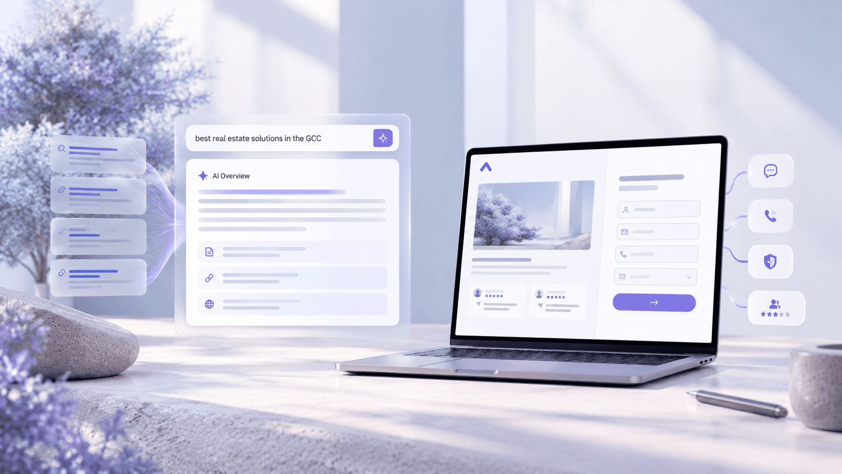
More people now ask a question and read a generated answer instead of clicking ten blue links. Those tools pull from pages that are clearly organized and that answer things directly.
That doesn't mean rewriting everything for robots. It mostly means writing the way a helpful person would talk: a clear heading, a straight answer in the first couple of sentences, then the detail for anyone who wants it. Pages built like that tend to work well for readers and for machines, which is a nice coincidence.
Conversion is a design problem too
Traffic is only half of it. Say a hundred people land on your homepage. How many do something?
Small things move this number more than big redesigns do. A form with four fields instead of nine. A phone number that's tappable on mobile. A clear next step at the end of every page, rather than a dead end. Proof near the point of decision: a real client name, a real result, a short testimonial.
We've watched a change as small as rewording a button lift enquiries noticeably. Not every time, and we'd be suspicious of anyone who promises it will. But testing small changes beats guessing at big ones.


Plan before you build
If there's one habit that separates the projects that work from the ones that don't, it's what happens before anyone opens a design tool.
Spend the first week or two on the unglamorous questions. Who exactly is this for? What do they search for? What are competitors doing well, and where are they weak? What should the site map look like so that every page earns its place?
Skipping this stage feels like saving time. It usually costs more, because you end up redesigning pages you shouldn't have built in the first place.
Make it yours to run
One more thing that doesn't get talked about enough: you should be able to run your own website.
If adding a blog post or updating a price needs a developer and a week's wait, you'll stop doing it, and the site goes stale. A well-set-up content management system plus an hour of proper training means your team can handle day-to-day updates themselves. You should also own your hosting and domain accounts. If a relationship with an agency ends, your site shouldn't be held hostage.

What it takes, realistically
A focused company site of five to ten pages usually takes three to four weeks when the planning is done properly. Larger builds, such as e-commerce, booking systems or membership areas, run longer, often up to eight weeks. Cost depends on page count, features and design depth, so be wary of anyone quoting a fixed price before they've asked you a single question.
A quick self-check
Open your own website on your phone, on mobile data, and try to do what a new customer would do. Then ask yourself:
Did it load in under three seconds?
Is it obvious what we do within five seconds?
Can I contact the business in two taps?
Would a stranger trust this enough to reach out?
If you hesitated on any of those, that's where to start. Not with a new logo, and not with a full rebuild, but with the one thing that's costing you the most.
At Nash Studio, we build websites that are meant to bring in business, not just to be admired. If you'd like an honest look at what your current site is and isn't doing, get in touch for a no-pressure conversation.
Stay Inspired
Get fresh design insights, articles, and resources delivered straight to your inbox.
Latest Blogs



Stay Inspired
Get fresh design insights, articles, and resources delivered straight to your inbox.
Insights
Your Website Isn't a Brochure. It's the Hardest-Working Person on Your Team.
Your Website Isn't a Brochure. It's the Hardest-Working Person on Your Team.
Most business websites look fine and sell nothing. Here's what actually separates a site that brings in customers from one that just sits there.
Most business websites look fine and sell nothing. Here's what actually separates a site that brings in customers from one that just sits there.
Last month a client sent us a screenshot of their analytics and a one-line message: "We paid a lot for this site. Where are the customers?"
The site was beautiful. Clean fonts, a slick hero image, a tasteful animation on the logo. It also had eleven visitors a day, and nine of them left within five seconds.
We hear some version of that story more than we'd like. And the uncomfortable truth is that nobody did anything wrong in the usual sense. The designer delivered what was asked. The developer shipped on time. The site simply wasn't built to do a job.
Start with the job, not the layout
Ask most people what their website is for and they'll say something like "to look professional." That's fair, but it's a low bar. A website can look professional and still be invisible.
A better question: if this site were an employee, what would we hire it to do? Answer enquiries at 2 a.m.? Qualify leads before your sales team ever picks up the phone? Convince a cautious buyer that you're the safe choice?
Once you can say the job in one sentence, a lot of design decisions get easier. You stop arguing about the shade of blue and start asking whether a visitor can find the "request a quote" button without hunting for it.
Why good-looking sites still don't get found
Search is where most first visits begin, and it's where a lot of sites quietly fall apart. The usual culprits are boring, which is exactly why they get ignored:
Structure nobody planned. Pages added over time with random URLs and no clear hierarchy. Google can't tell what matters, and neither can a person.
Slow loading. Oversized images and heavy scripts. If a page takes four seconds on a mid-range phone, a good share of people are already gone.
Desktop-first thinking. Most traffic in our region comes from phones. A site designed on a big monitor and squeezed down afterwards usually feels like it.
No structured data. Schema markup is a small bit of code that tells search engines what your business is, what you offer, and what questions you answer. Skipping it is like leaving the label off a product.
Thin, vague copy. "We provide high-quality solutions" says nothing. Specific answers to specific questions do far better, both in search results and with the new wave of AI answer tools.
None of this is glamorous. All of it is fixable, and it's far cheaper to get right at the start than to retrofit after launch.
The AI search shift is already here
More people now ask a question and read a generated answer instead of clicking ten blue links. Those tools pull from pages that are clearly organized and that answer things directly.
That doesn't mean rewriting everything for robots. It mostly means writing the way a helpful person would talk: a clear heading, a straight answer in the first couple of sentences, then the detail for anyone who wants it. Pages built like that tend to work well for readers and for machines, which is a nice coincidence.
Conversion is a design problem too
Traffic is only half of it. Say a hundred people land on your homepage. How many do something?
Small things move this number more than big redesigns do. A form with four fields instead of nine. A phone number that's tappable on mobile. A clear next step at the end of every page, rather than a dead end. Proof near the point of decision: a real client name, a real result, a short testimonial.
We've watched a change as small as rewording a button lift enquiries noticeably. Not every time, and we'd be suspicious of anyone who promises it will. But testing small changes beats guessing at big ones.
Plan before you build
If there's one habit that separates the projects that work from the ones that don't, it's what happens before anyone opens a design tool.
Spend the first week or two on the unglamorous questions. Who exactly is this for? What do they search for? What are competitors doing well, and where are they weak? What should the site map look like so that every page earns its place?
Skipping this stage feels like saving time. It usually costs more, because you end up redesigning pages you shouldn't have built in the first place.
Make it yours to run
One more thing that doesn't get talked about enough: you should be able to run your own website.
If adding a blog post or updating a price needs a developer and a week's wait, you'll stop doing it, and the site goes stale. A well-set-up content management system plus an hour of proper training means your team can handle day-to-day updates themselves. You should also own your hosting and domain accounts. If a relationship with an agency ends, your site shouldn't be held hostage.
What it takes, realistically
A focused company site of five to ten pages usually takes three to four weeks when the planning is done properly. Larger builds, such as e-commerce, booking systems or membership areas, run longer, often up to eight weeks. Cost depends on page count, features and design depth, so be wary of anyone quoting a fixed price before they've asked you a single question.
A quick self-check
Open your own website on your phone, on mobile data, and try to do what a new customer would do. Then ask yourself:
Did it load in under three seconds?
Is it obvious what we do within five seconds?
Can I contact the business in two taps?
Would a stranger trust this enough to reach out?
If you hesitated on any of those, that's where to start. Not with a new logo, and not with a full rebuild, but with the one thing that's costing you the most.
At Nash Studio, we build websites that are meant to bring in business, not just to be admired. If you'd like an honest look at what your current site is and isn't doing, get in touch for a no-pressure conversation.
Stay Inspired
Get fresh design insights, articles, and resources delivered straight to your inbox.
Latest Blogs
Stay Inspired
Get fresh design insights, articles, and resources delivered straight to your inbox.
Insights
Your Website Isn't a Brochure. It's the Hardest-Working Person on Your Team.
Your Website Isn't a Brochure. It's the Hardest-Working Person on Your Team.
Most business websites look fine and sell nothing. Here's what actually separates a site that brings in customers from one that just sits there.
Most business websites look fine and sell nothing. Here's what actually separates a site that brings in customers from one that just sits there.
Last month a client sent us a screenshot of their analytics and a one-line message: "We paid a lot for this site. Where are the customers?"
The site was beautiful. Clean fonts, a slick hero image, a tasteful animation on the logo. It also had eleven visitors a day, and nine of them left within five seconds.
We hear some version of that story more than we'd like. And the uncomfortable truth is that nobody did anything wrong in the usual sense. The designer delivered what was asked. The developer shipped on time. The site simply wasn't built to do a job.
Start with the job, not the layout
Ask most people what their website is for and they'll say something like "to look professional." That's fair, but it's a low bar. A website can look professional and still be invisible.
A better question: if this site were an employee, what would we hire it to do? Answer enquiries at 2 a.m.? Qualify leads before your sales team ever picks up the phone? Convince a cautious buyer that you're the safe choice?
Once you can say the job in one sentence, a lot of design decisions get easier. You stop arguing about the shade of blue and start asking whether a visitor can find the "request a quote" button without hunting for it.
Why good-looking sites still don't get found
Search is where most first visits begin, and it's where a lot of sites quietly fall apart. The usual culprits are boring, which is exactly why they get ignored:
Structure nobody planned. Pages added over time with random URLs and no clear hierarchy. Google can't tell what matters, and neither can a person.
Slow loading. Oversized images and heavy scripts. If a page takes four seconds on a mid-range phone, a good share of people are already gone.
Desktop-first thinking. Most traffic in our region comes from phones. A site designed on a big monitor and squeezed down afterwards usually feels like it.
No structured data. Schema markup is a small bit of code that tells search engines what your business is, what you offer, and what questions you answer. Skipping it is like leaving the label off a product.
Thin, vague copy. "We provide high-quality solutions" says nothing. Specific answers to specific questions do far better, both in search results and with the new wave of AI answer tools.
None of this is glamorous. All of it is fixable, and it's far cheaper to get right at the start than to retrofit after launch.
The AI search shift is already here
More people now ask a question and read a generated answer instead of clicking ten blue links. Those tools pull from pages that are clearly organized and that answer things directly.
That doesn't mean rewriting everything for robots. It mostly means writing the way a helpful person would talk: a clear heading, a straight answer in the first couple of sentences, then the detail for anyone who wants it. Pages built like that tend to work well for readers and for machines, which is a nice coincidence.
Conversion is a design problem too
Traffic is only half of it. Say a hundred people land on your homepage. How many do something?
Small things move this number more than big redesigns do. A form with four fields instead of nine. A phone number that's tappable on mobile. A clear next step at the end of every page, rather than a dead end. Proof near the point of decision: a real client name, a real result, a short testimonial.
We've watched a change as small as rewording a button lift enquiries noticeably. Not every time, and we'd be suspicious of anyone who promises it will. But testing small changes beats guessing at big ones.
Plan before you build
If there's one habit that separates the projects that work from the ones that don't, it's what happens before anyone opens a design tool.
Spend the first week or two on the unglamorous questions. Who exactly is this for? What do they search for? What are competitors doing well, and where are they weak? What should the site map look like so that every page earns its place?
Skipping this stage feels like saving time. It usually costs more, because you end up redesigning pages you shouldn't have built in the first place.
Make it yours to run
One more thing that doesn't get talked about enough: you should be able to run your own website.
If adding a blog post or updating a price needs a developer and a week's wait, you'll stop doing it, and the site goes stale. A well-set-up content management system plus an hour of proper training means your team can handle day-to-day updates themselves. You should also own your hosting and domain accounts. If a relationship with an agency ends, your site shouldn't be held hostage.
What it takes, realistically
A focused company site of five to ten pages usually takes three to four weeks when the planning is done properly. Larger builds, such as e-commerce, booking systems or membership areas, run longer, often up to eight weeks. Cost depends on page count, features and design depth, so be wary of anyone quoting a fixed price before they've asked you a single question.
A quick self-check
Open your own website on your phone, on mobile data, and try to do what a new customer would do. Then ask yourself:
Did it load in under three seconds?
Is it obvious what we do within five seconds?
Can I contact the business in two taps?
Would a stranger trust this enough to reach out?
If you hesitated on any of those, that's where to start. Not with a new logo, and not with a full rebuild, but with the one thing that's costing you the most.
At Nash Studio, we build websites that are meant to bring in business, not just to be admired. If you'd like an honest look at what your current site is and isn't doing, get in touch for a no-pressure conversation.
Stay Inspired
Get fresh design insights, articles, and resources delivered straight to your inbox.
Latest Blogs
Stay Inspired
Get fresh design insights, articles, and resources delivered straight to your inbox.